¶ Monthly Key Performance Indicators
This is the big one - the Monthly KPI report! It's delivered once a month on the first of the month or the next business day thereafter. This report is a great way to review your entire month at a glance. There are several pages chocked full of practice metrics present on this report. The entire report varies in length depending on the software you're currently using to manage your practice.
You can begin to identify key procedures and trends in your practice with this 'Big-Picture' view. It's also a great tool to identify some strengths, weaknesses, and opportunities present in your dental practice. This report provides the background to that insight. Are enough of your prophy patients getting the perio treatment they really need? Are you losing too many appointments to cancellations? Is one of your associates or hygienists not scheduling their patients to return to the office? How much of your overall production comes from your hygiene providers?
Over time you'll begin to identify these trends in scheduling, your practice, and your patients. Use these reports to train your team and to identify the potentials for growth.
¶ This report is broken down into key segments examining different aspects of the practice:
- Production and Income
- Patient Data
- Top Procedures
- Hygiene KPI's
- Statistics by Provider
- Accounts Receivable
- Summary Statistics
Let's look a little closer at these sections:
¶ Production & Income
¶ Production & Income Office Totals
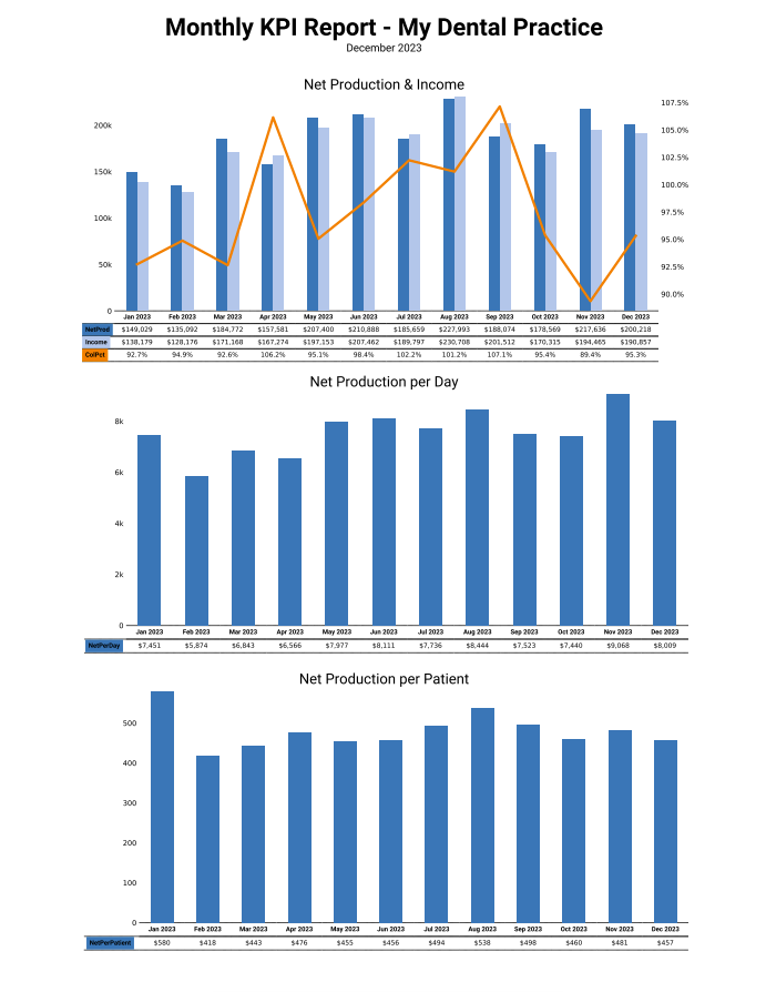
This Net production gives you the tools to see how your month went as far as generating income. The first graph on the upper left indicates just that - your NET Production (after all adjustments) and your income or collections for those days. Underneath each month's stamp, you can see there is the numerical representation of the NET production, the Net Collection, and the Collection Percentage. This chart is a great graphical representation of when your practice thrives throughout the year. As you can see, since this month is for December, the months are all completed and have comparable numbers. As you will learn in future months, the graphs are only shown with those months with numbers in place. That is, your current month, back to January will be visible on the graph. As a good rule of thumb, you would like your Income numbers to be close to your Net Production numbers. This will also be reflected in your collection percentage on other reports that you receive daily and weekly.
¶ Net Production per Day
You can also see the NET production per day. Each day is logged individually, and you can see after all adjustments have been applied, the NET production for the month. This quadrant gives you a nice visual so you can identify your strong months, and those months where maybe you could ramp up your marketing efforts, or look to see if there are training opportunities to improve the team. Maybe check the phone logs - there are lots of reasons why production can be up or down on any given month.
¶ Net Production per Patient
This chart shows the average NET production per patient. Bear in mind that this number will change based on how many patients you see each month. This graphical representation of your average production per patient should fall in line with your NET production graph, but it at least gives you some insight. Maybe December was full of crown and bridge appointments and boosted your average considerably. The summer months could have been filled with recall examinations and simple fillings, leading to a smaller per patient production tally. You have the tools to identify and act upon those trends.
¶ Page 2
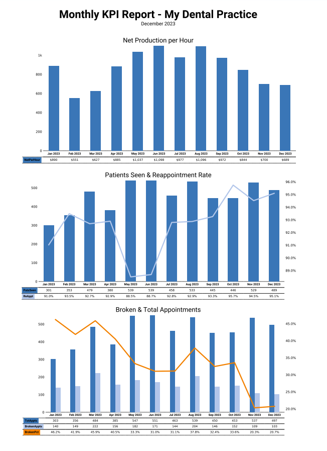
¶ Net Production per Hour
This graph identifies the NET Production per hour across all providers for the month. These metrics are derived from pretty simple math, Total Production (Net) posted over Hours Worked. In the Open Dental environment, the working hours are taken from the Setup--> Schedules Tool. Dentrix and Eaglesoft store this information differently, so we take it directly from your working schedule. In the Dentrix or Eaglesoft environment, your 'working hours' are defined as the time your first patient's first appointment starts to the time their last appointment ends. We also build in an hour for lunch/breaks.
Arming yourself with the knowledge, you can see why overall production may be down across different months. Perhaps you took a vacation (or a CE Course) and was out of town for a week. That would lower the overall production for those months considerably. It could be that you saw some family all on the same day for a month, and that their adjusted production was next to nothing. Having these charts give you the tools to find those opportunities within your business and your practice. Learn from these trends and make some changes. Set goals for the practice and the providers and strive to stay close to them.
¶ Patient Data
¶ New Patients & Atritions
This chart illustrates the new patient growth at your practice vs those patients that haven't been in for 18 months (attrition). This is how Divergent defines Attrition. New patients that have made and kept (and posted) an appointment are indicated in dark blue. New Patients are counted on the date of their first completed procedure code, so they will only be counted once for your practice. The number of patients set as archived or dismissed are the attrition numbers. These are indicated by the light blue data set. A patient is considered as fallen into attrition when their last complete appointment was 18 months ago.
This is a great chart to identify opportunities in new patient marketing or patient retention efforts. Do you have a system in place for reactivating patients that haven't been scheduled)